

How to Structure a Homepage That Actually Converts
A homepage should do more than simply look good.
Its job is to guide visitors, communicate value clearly, and help potential customers take action. Many small business homepages struggle because they focus heavily on visuals while overlooking structure, messaging, and user experience.
A high-converting homepage is usually simple, intentional, and designed around what visitors need to understand within the first few seconds.
Why Homepage Structure Matters
When someone lands on your homepage, they are quickly deciding whether your business feels trustworthy, relevant, and worth exploring further. If the structure feels confusing or overwhelming, many users leave before taking action.
Good homepage structure creates clarity and momentum. It helps visitors understand what you offer, why it matters, and what step they should take next.
Start With a Clear Headline
Your headline is one of the most important parts of the page because it shapes the first impression immediately.
Visitors should quickly understand what your business does and who it helps. Vague or overly clever headlines often create confusion instead of clarity.
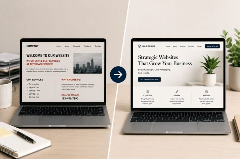
A headline like “Creative Digital Solutions” sounds polished, but it does not communicate much. Something more direct, such as “Strategic Website Design for Growing Businesses,” immediately gives visitors context.
Clear messaging almost always performs better than complicated messaging.
Add a Supporting Subheadline
The subheadline should expand on the headline and explain your value more clearly.
This is a good place to briefly communicate your services, your approach, and the outcome you help create. A strong subheadline reinforces trust and gives visitors more confidence that they are in the right place.
For example:
I design websites that combine strategy, SEO, and user experience to help businesses attract the right audience and convert visitors into customers.
Simple, clear language is usually the most effective.
Use a Strong Call-to-Action
Visitors should never have to guess what to do next.
Your primary call-to-action should feel visible, intentional, and action-oriented. Buttons like “Learn More” or “Click Here” are often too vague to guide users effectively.
More specific calls-to-action tend to perform better because they create clearer expectations. Phrases like “Start Your Project,” “Schedule a Consultation,” or “View Portfolio” feel more purposeful and direct.
Good calls-to-action reduce hesitation and help move users through the website naturally.
Keep Navigation Simple
Navigation plays a major role in how professional and easy-to-use a website feels.
Too many navigation links can create decision fatigue and make the website feel cluttered. Most small business websites only need a few core pages clearly organized in the menu.
Keeping navigation focused helps users quickly find important information while improving the overall browsing experience.
Prioritize Visual Hierarchy
Visual hierarchy helps guide attention throughout the page.
A well-structured homepage naturally directs users toward the most important information first. Typography size, spacing, contrast, and layout organization all influence how visitors process content.
When every section competes equally for attention, users often feel overwhelmed. Cleaner layouts with intentional spacing usually feel more trustworthy and easier to navigate.
In many cases, simplifying the design improves performance more than adding additional design elements.
Include Trust-Building Elements Early
Visitors look for reassurance quickly, especially when they are unfamiliar with your business.
Testimonials, project examples, years of experience, recognizable clients, or case studies all help strengthen credibility. Even subtle trust signals can make a major difference in whether someone continues exploring the website.
The earlier trust is established, the more likely visitors are to engage further.
Explain Your Services Clearly
Many homepages mention services without fully explaining what they actually involve.
Your homepage should quickly communicate what you do, how it helps, and why it matters. Short sections with concise descriptions are often more effective than long paragraphs filled with industry jargon.
The goal is to make information easy to scan while still communicating value clearly.
Design for Mobile First
A homepage may look polished on desktop while still performing poorly on mobile devices.
Since most users browse from phones, mobile responsiveness directly affects usability, engagement, SEO, and conversions. Text should feel readable, spacing should remain consistent, and navigation should stay simple across all screen sizes.
A strong mobile experience often creates a stronger overall impression of professionalism.
Use Intentional Imagery
Images should support the message rather than distract from it.
Strong homepage visuals often feel cohesive, clean, and intentional. Professional photography, refined mockups, and consistent branding help reinforce credibility while improving the overall visual experience.
Overcrowding the homepage with excessive graphics, animations, or visual effects can make the website feel less focused.
End With a Strong Closing Section
Many visitors scroll directly to the bottom of a homepage before deciding whether to take action.
Your closing section should reinforce what you offer, why it matters, and what visitors should do next. A clear final call-to-action helps create direction and gives users a logical next step.
Simple messaging usually performs best here.
Why Strong Homepages Matter
A high-converting homepage is rarely about adding more content or more design elements. In most cases, it comes down to clarity, structure, and intentional user experience.
The most effective homepages tend to feel focused, easy to navigate, and visually consistent. They guide visitors naturally through the experience while building trust and reducing friction along the way.
When strong messaging, thoughtful structure, and clear calls-to-action work together, a homepage becomes more than just an introduction to a business. It becomes a tool that actively supports growth and helps turn visitors into customers.