They Call Me Mista Yu
YouTube Channel Design & Content Optimization
About Project
They Call Me Mista Yu is a content-driven YouTube channel focused on podcast-style discussions and video content.
The goal of this project was to create a cohesive visual identity and organize the channel in a way that improves clarity, consistency, and viewer engagement across all content.
My Role
Designing a YouTube experience built for clarity and consistency.
The design strategy focused on creating a unified visual identity across the channel while improving how content is structured and presented.
Thumbnails, podcast covers, and banner elements were redesigned to eliminate visual inconsistency and create a recognizable brand. The channel layout was reorganized to highlight key content, making it easier for viewers to navigate between podcast episodes, playlists, and featured videos.
The Challenge
The channel lacked visual consistency and structure. Podcast thumbnails used clashing colors and styles, making the brand feel fragmented. Content was not clearly organized, which made it difficult for viewers to find and follow specific series.
The Solution
A cohesive brand system was created across all visual elements, including the logo, banner, and podcast artwork. Content was reorganized into structured playlists, and the homepage layout was streamlined to guide viewers through the channel more effectively. Channel descriptions and supporting assets were also optimized to improve clarity and presentation.
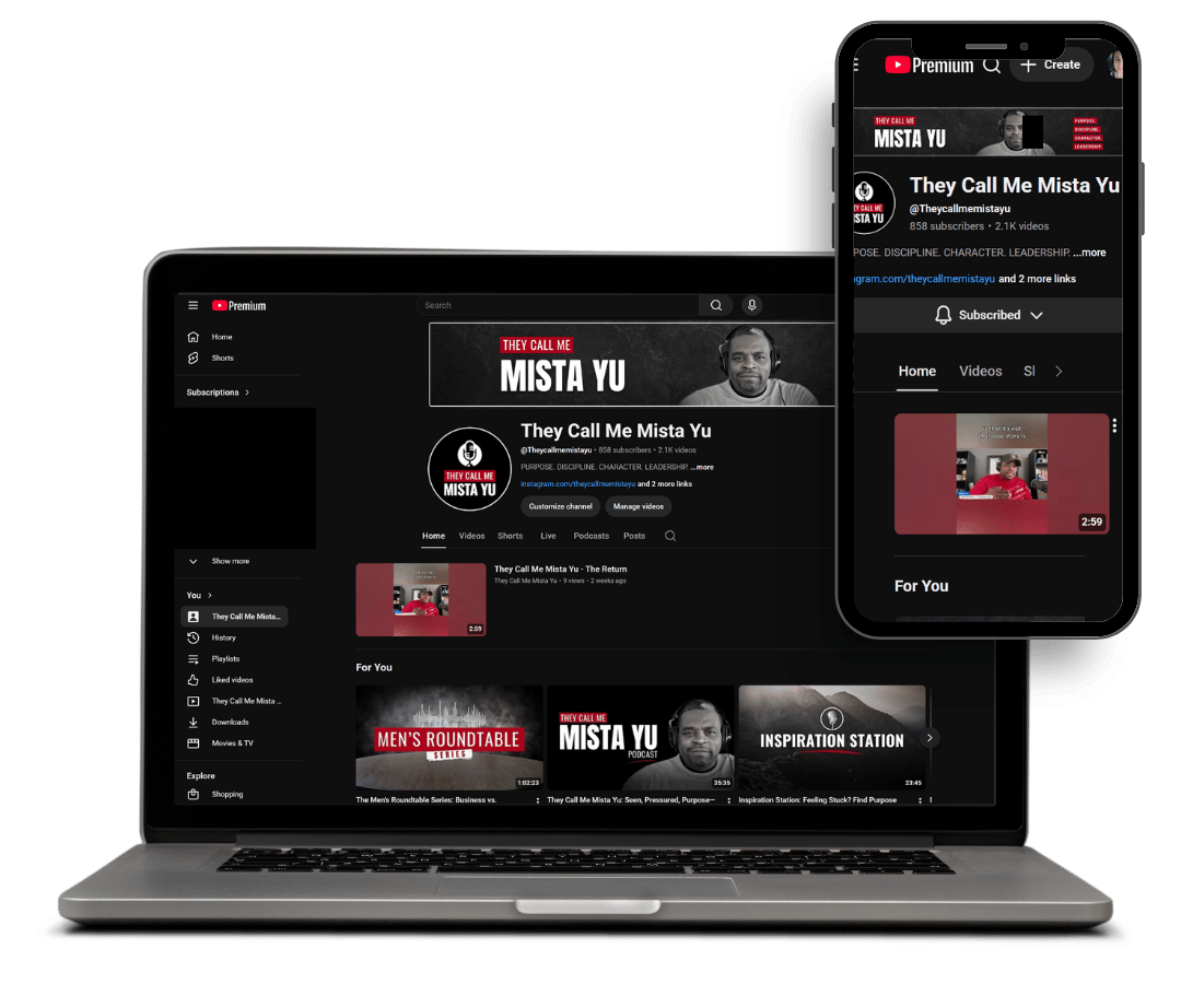
Before & After: Channel Transformation
The redesign focused on improving visual consistency, organizing content into clear categories, and creating a stronger brand presence across the channel.
Before
The channel lacked a clear visual identity and structured layout. Thumbnails and podcast covers used inconsistent colors and styles, making the content feel disconnected.
Videos were not organized into defined playlists, and the homepage did not guide viewers toward key content. As a result, it was difficult for new visitors to understand the channel or find specific series.
After
The channel was redesigned with a cohesive visual system and a more intentional structure. Thumbnails and podcast covers were standardized to create a consistent, recognizable brand.
Content was organized into clear playlists and categories, and the homepage was streamlined to highlight featured series and improve navigation. The result is a cleaner, more professional channel that makes it easier for viewers to explore and engage with the content.
4
Podcast Cover Designs Standardized
3+
Content Categories Structured (Podcasts, Playlists, Featured Content)
100%
Brand Consistency Across Channel Assets
View More Projects


Ready to Build a Website That Works for Your Business?
Whether you need a new website, SEO improvements, or a stronger digital presence, I’d love to help.